An update:

Must apologise for not posting in a while! I have been busy.

I do have Pinterest now though, which is really awesome, I am under Fozzy Foster (fozzyfozz.) It’s a great site for collecting and finding visual inspiration.

I also have a Stumble Upon account, which is a personal favorite and similar to Pinterest, I’m on there as Fozzyfoster12!

I promise to come back and post loads of stuff! My own work!

Artist Research: Photography

Photography: Artist Research

Henri Cartier-Bresson

This photographer was introduced on the slideshow as an example of leading lines, and visual communication in photography. I thought his images were really powerful and executed photographic concepts really well.

His work has very intense artistic elements, but he has been described as a photojournalist and a street photographer, so the genre I think is hard to pin down exactly. Despite the notion of serendipity in his images, the photographer must have spent many hours and lots of film waiting and looking for these “perfect,” shots.

I find the striking use of line and the way that is used to lead the viewer the most inspiring, and in my own work I looked for shots that capture similar attention to composition.

cartier< This picture shows a spiral staircase from the bottom, looking up. Over the banister faces peer down all the way to the very top.

The faces look like children’s faces and a viewer would assume they were looking down at the photographer. The genre and style of most of the artist’s photographs would suggest that this is a chance image, but it could easily have been arranged. There are many pictures of his from Paris that show images of children in the streets.

This is a photograph of Cartier-Bresson’s that I really like. The plane of the cycle track leading away, with the person lying on it creates a wonderful sense of space and angle.
PAR90956

<Another imaPAR37363ge in his cycling series, quiet playful, reading a newspaper whilst on a bicycle, the angle of his right leg, and the curvature of the track behind him create a sort of “wonky,” or off balance feel to the overall image. But equally a clearly intentional point of view has been chosen here, the railing to the right, the lines on the track, the track itself, and the overhead lights all lead away, not quiet to a vanishing point, but to an interesting curve that, with the cyclist, combine to create memorable imagery.  The works I find most interesting I think have a graphic quality to them. Using strong, bold lines and shapes in conjunction to create compositions that work the best, or capture a viewer’s attention the most.

Bernd And Hilla Becher

A collaborative effort concentrating on industrial architecture, some of my favorites are series of similar structures presented together as little thumbnails.

This is a series of spherical industrial buildings. Simply called “Gas Tanks,”which are not all exactly the same but share many very similar properties, I think the ordering of these pictures is important, almost like a development of the same image changing over time. Alternatively they have simply chosen the best side because the photographers have paid attention to the way elements of the building change the composition of the shot, for example the way the stair cases dissect the sphere diagonally.

bernd-hilla-becher-gas-tanks_1983-92

tumblr_lphqp5Itti1qj82c7o1_500

Below the gas tanks is part of a series of furnaces entitled “Tall Furnaces,” unfortunately I could not find a good resolution image to use, so I have taken this individual one. I like the way the pipes stretch down over the overall structure.

The emphasis on strong lines and forms is satisfying and skilful because it takes the otherwise mundane and presents it in an interesting way.
The images are nearly all taken head on, capturing the objects in their entirety and focusing on the overall shape, despite the viewer being able to see the whole structure they still manage to be mysterious and unusual, raising questions about the function of the object.

This is particularly relevant if you consider the pipes as leading lines, receding behind and into the structure, drawing you in to consider what the machine does.

Tim Simmons
A contemporary photographer who experiments with light to create abstract landscapes. Using a very long exposure he casts light around his subject, he is moving too “fast,” for the camera, but by going over and over with the light he creates a lit subject. This creates a really interesting effect; surreal glowing objects and scenes.

This picture is called blue lagoon #7 from a series of shots taken in Iceland. The qualities of his photograph are unusual and for me connote an almost fairy-tale like appearance: Because the colors are strong and there is an unnatural focusing of light. Also there is a lot of detail and information for a viewer to take in; his work involves lots of surface detail and texture.

Tim-Simmons20

tim-simmons

Underneath the lagoon is a picture that i think illustrates the fairy tale idea well, the lit forest path, with the shadows receding unnaturally into the woods behind. And what looks like a mountain in the distance.

I think the unusualness of the effect must come from having an artificial light source with a single direction, unlike the sun and sky which provide a uniform lighting from above.

Tim Simmons’ work has strong painterly and illustrative elements, as well as being somewhat abstract because composition is not the primary focus of his photographs; or rather it is dictated by how he wants the light to look. There is also something about the nature of depth in his shots; the blue lagoon for example almost looks like a faraway river, or maybe a very close stream.

Raul Belinchon is another excellent photographer we have been researching, his work covers a whole range of genres but his work in auditoriums shows brilliant use of wide angle lenses to create a sense of space and symmetry. Unfortunately I could not find any large, high resolution images to post.

Apologies for the appauling formating of this post, I can’t understand how to put pictures into a post without it sending the text all over the place.

How concepts of value and purpose affects analyses of art and design


Art and design covers a wide range of disciplines but broadly speaking; its “purpose,” could be any of the following on their own or together. The list is not exhaustive.

Expression
Communication
Shock
To inspire debate
To represent, document or tell a story
To explore culture, mass identity
Or to inform culture/our mass identity
“To reflect the “zeitgeist.”
Decoration

This list could be made more specific for particular practices such as fashion design:

Functionality
Exploring/questioning ideas of beauty and style
Documentation of style
To inform/explore our o
utward identity

A person, group or societies’ idea about a given art form’s purpose dictates to a certain extent its value. A culture that seeks to express the notion of democracy will, in its architecture, attempt to emulate the style of the Ancient Greeks. For example, The White House. This would then be deemed to be a valuable or successful piece of design, of course this will always create a group of people who actively wish to destroy, reject, subvert or challenge those notions, or to challenge the actual perception of value.

Ideas of value and purpose are ever present in a person’s mind, and can influence their interpretation, analyses and appreciation for a piece of art/design.  It is therefore important to be aware of a variety of contexts, and also a variety of “critical perspectives, or “ways of seeing.” This can allow a viewer to gain a better understanding of the art and their own reaction to it, and for an artist, how to manipulate that to better fulfill their own purposes.

An understanding of how those values and purposes change, how the meanings of “value and purpose,” change, is also important. Over time, across culture. Is Tracey Emin’s My Bed,” a “better,” or “more accurate,” self-portrait than a technically precise self-portrait drawing by a renaissance artist? Because it’s her things, as they were etc.

As well bearing in mind that “meaning,” changes from person to person, and digital reproduction and television has changed art and its context. It loses the elements of pilgrimage and religiosity but gains more accessibility and “democracy.” So without imposing a definite meaning, a viewer must be aware of the different possibilities and why they exist.

Zak Smith – An artist that Inspires me

Image

Exert from sketchbook.

Zak Smith is an American artist who works a lot with ink. His work is characterized by strong uses of line and pattern, particularly chaotic and jumbled collections of shapes. His work is complex, and he often works very small producing many smaller images and presenting them together in series. I love his work, the aesthetic is gritty and violent, dark and anarchistic, full of punk sensibilities. This particular image is typical of his sketchbook work and casual art, random, abstract and engrossing. I think the range of patterns and marks is indicative of a daily strive for interesting effects to use in his professional work.

He is influenced by artists such as Egon Schiele and Gustav Klimt, but also comic art and general punk aesthetics. He borrows the high level of ornament and pattern from Klimt and also his use of decorative finishes, Smith uses acrylics and inks to achieve a liquid and reflective effect. In terms of subject matter he often draws and paints very sexual pictures of women, who are mostly co-workers of his in the porn industry.  He is easily my favorite artist, prolific and talented.

Cubism and Surrealism

Cubism: A style of abstract art that developed in the early 20th century, they sought to reject traditional western art, in particular, perspective, which artists had been seeking to represent since the renaissance. It is often associated with the artists Georges Barques and Pablo Picasso whose shared interest in the later works of Paul Cezanne led them to develop a style of their own. Cezanne himself felt that perspective was a way of denying the essential difference between reality and a painting, and so flattened his image and explored the surfaces and qualities of his 2 dimensional canvases.

Equally cubism sought to avoid static view points, choosing to represent, in 2D, more than one side of their subject, by doing this they hoped to express a notion of subjectivity and represent better what it was the artist themself saw. 

Another major influence in cubism, although Picasso always denied it, was art from other cultures, particularly African art. There are clear comparisons to be made between the angular, stylistic forms of African masks and artworks, and most historians and critics suggest that Picasso was inspired by a visit to a museum of African art in Paris.

Cubism went through two phases; the first is referred to as “analytical cubism,” it is typically monochromatic and involves the artist looking at reality, breaking it down, then rearranging it to create form. Eventually however new techniques developed within the movement, particularly mixing in collage with their painting, these works are typically more colourful, more abstract and are referred to as “synthetic cubism.”

Surrealism: Also developed in the early 20th Surrealism sought to explore the subconscious mind, influenced by the works of Marx and Freud it became a major international movement. Central themes of surrealism include spontaneity, juxtaposition and undertones of annihilation and nihilism, much of the philosophy of surrealism seems to stem from earlier movements like Dadaism. Prominent surrealist artists include Salvador Dali, Max Ernst and Rene Magritte; Dali in particular was a very prolific artist whose work stretched into sculpture, film, photography and writing. Also he was eccentric, extravagant and unusual, this reflected in his art and in the movement in general.

Rene Magritte’s famous painting of the smoking pipe, with the caption: “this is not a pipe,” is a very obvious example of the sort of anti-structure and confusion the surrealists wished to create in their work. Especially in that work the artist wanted to point out that the pipe in the painting, was just that, a painting, and not actually a pipe.

The Red Model

The red model: Surrealism often focused on unusual objects in familiar settings or familiar objects in unusual settings, playing with the new meanings this could bring to objects. Rene Magritte’s work also seeks to achieve this and had this to say about his own work: “visible images which conceal nothing; they evoke mystery and, indeed, when one sees one of my pictures, one asks oneself this simple question, ‘What does that mean?’. It does not mean anything, because mystery means nothing either, it is unknowable.” However a lot of Magritte’s work had humorously ironic symbolism hidden amongst the images.

It was painted just after his mother died and many people have commented that the back and forth play of reality reflects his feelings at that time. Also famous was his “this is not a pipe,” wishing to express the deceptive nature of images.

In this painting the two shoes change to feet or vice versa. I think it’s unusual in how well the texture and pattern of the background and environment are painted, but the feet are done in a more typical style, smoothed and avoiding detail, yet to a certain degree proportionally correct and tonally quite flat. I find the quality of surrealism difficult to described, as if the image has been squashed.

Love/Hate

Image

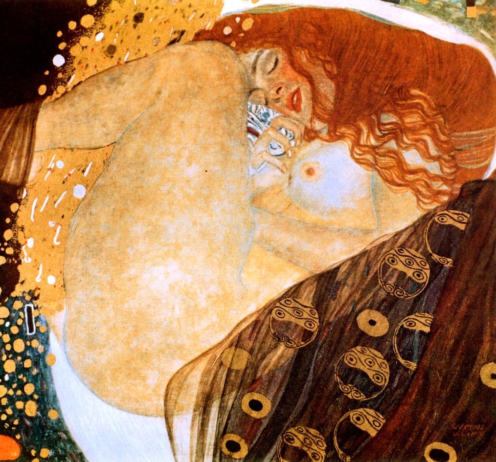
Gustav Klimt
Danae
1907
Oil Painting

I’m a huge fan of Klimt’s work, and I chose this piece because I think that it contains all the elements I like about his work, and it’s a work which I think achieves all those things particularly well.

A story from ancient Greek mythology that has been a popular subject amongst artists for a very long time, Rembrandt and Titan also produced work based around the tale of Danae. Danae was locked away in a tower by her father to stop her bearing children; because an oracle had professed the child would grow up to kill his grandfather. Zeus appeared as a rain of gold and impregnated her anyway, because the child was also destined to become the great hero Perseus.

I like this piece because of its composition, pattern, and surface quality and also I really enjoy Klimt’s painting style. The people in his work seem to drift in and out of the surface, playing with two and three dimensions, intermingling with the dense collections of shapes and patterns and the bright gold areas; his signature technique. A good example of this is the thin sheet like material that covers the woman’s back to the right, and foot on the far left. I enjoy how busy and jumbled the work is, but also how a viewer is drawn to the simple, calm, and beautiful woman. Klimt’s work focuses on female bodies and has been described as “frank eroticism,” but I think sensual and passionate are better ways of describing his appreciation of women. Especially in this painting, as Danae is a symbol for divine love, and transcendence.

Image

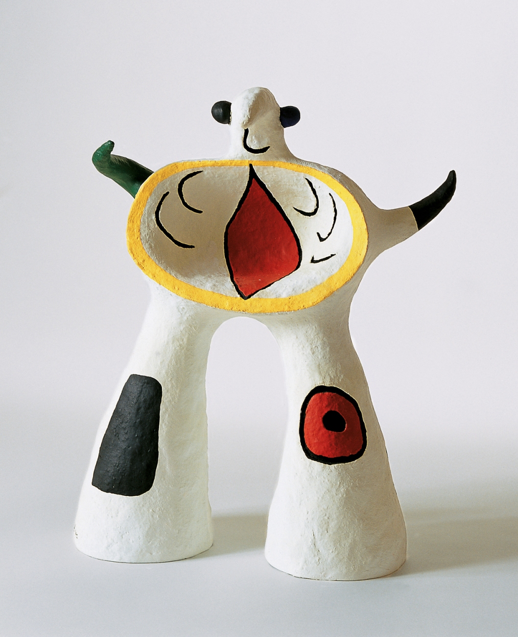
Joan Miró
Projet pour un monument
1979
plaster

I really dislike this piece because I struggle to appreciate it on any level, aesthetic, philosophical or technical. It is supposed to be a statement against art, a famous maxim of the artists’ was “assassination of painting,” he considered traditional painting, including the works of his contemporaries, such as Picasso, as a propaganda tool for the bourgeoisie. He famously said “I will smash their guitar!”

I do admire his individualism, he refused to join the surrealist groups because he wanted to be free to explore and experiment in other genres of art. None of his work inspires me or makes me want to be around it especially, I quite like the attempts of some artists to regress as it were to childlike expressions of form and shape, and I sort of like the bizarre characters he creates here, but I don’t like the ceramic medium, (probably because I’m not a huge fan of a certain type of ceramic anyway.)


Alison Lambert.
Thomas
2011
Charcoal and pastel over ripped, scrunched and layered paper.

“The way I draw has evolved over twenty-seven years… I use fresh white paper to cover previous unwanted marks and continue to draw over the top. White paper, like black charcoal and pastel becomes a tool for mark making much in the same way that a painter might use black and white paint.
This method is the way in which I search for the inner ‘spirit’ or emotional ‘self’ of a human head”

This piece although entitled “Thomas,” is actually a depiction of Judas Iscariot and was part of many other works by other artists for an installation in a church. These works and the theme of the installation were to explore the motives and nature of the character of Judas. The title is conceivably a comment on the nature of deceit, betrayal and belief. Thomas was the only disciple who did not believe Jesus had been resurrected until he was commanded to touch the wound, Jesus retorted with “Because you have seen me, have you believed? Blessed are they who did not see, and yet believed.” I get the impression that the artist is attempting to express this sentiment, or perhaps insinuating that Thomas’ actions were as bad if not worse than Judas’.


Paul Booker
Untitled Extract from artist’s sketchbook.
2004-2006
Ink on Paper

Paul Booker is a sculptor/artist who works at the Dallas University, Texas. And is someone I have been in contact with for some time. His work is influenced by a number of things, but he identifies as an abstract artist and has a rather relaxed attitude to the influence and meaning of his work. Rather seeking qualities he likes and then trying to emulate those qualities in his own work. I think this piece of sketchbook work, the first piece of his I ever saw, illustrates some of those ideas well. All his work is chaotic in form and space, but creates very strong illusions of both elements, this piece in particular also very textural.

His influences mostly revolve around things like schools of fish, swarms of insects and their hives, the way settlements build up and eventually have a sort of awkward semi-structure of their own and complex natural forms, like certain jellyfish which are not one organism, but several living in unison. He takes these ideas and develops them into large installations of coloured plastic and pins, or drawings and paintings like the one above.

Lebbeus Woods
Terrain/Tectonic landscapes
1999
An architectural model, probably card or plastic. (Medium not specified)

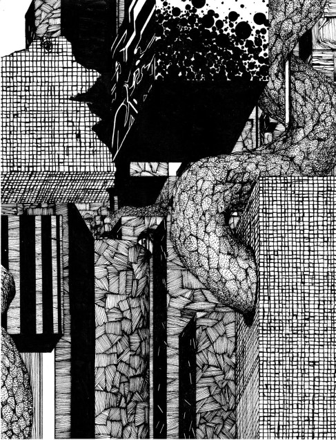
Lebbeus Woods is a theoretical architect. He designs and models buildings and teaches, but for the most part none of these are ever made, this is both a conscious decision on his behalf and because of the fact that most of his work explores possibilities, or impossibilities! His work is described as post-structuralist and he self identifies this way, much of his work revolves around the destruction of form and structure. His website says that he wants to explore the spaces a person can occupy and the way architecture provides those spaces. He does not necessarily seek to “disturb stability,” but to “provide strategies for adaption when transformation occurs. Even more they celebrate change.”

This particular image and series of models best shows a running theme in his ideas and art; that of the shapes and patterns found in destroyed buildings, especially those demolished in earthquakes. His work often takes boxes, which he considers the most basic architectural shape, and within them creates random, chaotic and broken looking intrusions to build new spaces within. This is both an attempt to practically overcome the issues of structural integrity and find beauty in its eventual downfall and as an ideological or philosophical statement against “structure.”

Sophie Ryder
Eye (Triptych)
Wire, painted and galvanized
2007

Sophie Ryder is a contemporary British sculptor who works mostly with wire to create huge 3D figures with a general theme of fantasy creatures and hybrid beings. In her 2D work, she uses wire to create large images which look a lot like drawings. Both her sculpture and two dimensional works are an excellent example of texture and surface in art, but also the way the ways in which, especially here, tone, form and shape can be created.

The work has been described as “playful,” and “joyful,” but also “mysterious,” and “intriguing,” I think this is intentional because of her choice of medium, the specific and individual nature of each wire, each mark, draws a viewer in to inspect and understand the piece better. In her sculptures this is equally achieved, but doubly so in certain works, where the figure is made from found objects, toys and smaller figures sometimes, so that on closer observation, there is more to see, hidden in the surface.

Steven Spazuk
Selfportrait
2007
Soot on card.

A French artist who envisioned in a dream himself drawing with a candle, inspired, he tried the technique, and burnt all his paper. But after experimentation with more plasticised card mediums found that the soot rested on the surface and could be etched. He uses this technique here with great representational accuracy; his other works attempt to explore more closely the nature of the burn marks. Particularly with his looser work he creates a burn and then scratches away at the soot to find forms within that, “a buttock here, and arm there.” With his larger works, like this self-portrait, he takes many cards and fragments the image, working on a small section at a time. The soot and etching technique brings out wonderful tonal contrast which leads to a masterful realization of form and space. But also I think his work deals a lot with the quality of surfaces, and what can be found within them.

Pablo Picasso’s Woman with Mandolin

Woman with mandolin 1910

Oil on canvas

The work is in the cubist style, which was a movement that sought to reject the “traditional techniques of perspective, modelling and foreshortening.” Instead emphasizing the “two-dimensionality of the canvas.”

This was achieved by abstracting the forms and shapes of the subject; cubist artists “reduced and fractured objects into geometric forms, and then realigned these within a shallow, relief like space.” Personally I have always felt that cubist work was actually successful in representing 3-dimensional spaces by crafting such series of angled facets, which tricks the viewer into a new sense of depth and space. As if the artist were trying to represent all the different sides of the subject at once.

In some pieces this can create a great sense of movement, of the shift and flux that happens to all things at all times, the jumble of forms creates rhythm and dynamism. I think this is noticeable in the shoulders of the woman. However the color palate of this piece is decidedly muted, consisting entirely of drab browns and ochre’s which to me suggests the movement of form is the focus. An intentional attempt to literally move the viewer around the shapes.

One of my favourite elements of Picasso’s work is his how he draws attention to specific parts of his painting, particularly in his studies of musicians, I think the hands and instruments are often more boldly, sharply, and almost lovingly defined. The mandolin is darker, rounder, standing out starkly against the woman’s body, and her hands are clear and interesting, I like how the thumb on her right hand is tucked behind her palm and her fingers bent inwards to pluck. Also the artist draws attention to this area of his work by balancing the composition of the whole piece; the background and upper section of the woman are busier and more chaotic, whilst the lower right is quieter.

Hello!

Started this blog to record and upload my time and work at the Leeds College of Art.

I’m studying an extended diploma in art and design, a level 3 (equivalent to A level’s) course that lasts 2 years.

Hopefully I’ll have some cool pictures and stories to post on here very soon.